
In this blog tutorial I’m going to show you how to create this beautiful petunia flower with rain drops accenting its leaves and petals. This artwork is visually appealing because of its high contrast and assorted textures. Since the last blog I did covered creating water droplets in great detail, I thought it would be wonderful to have a project to use them in. Rain drops / Water Droplets / Dew Drops / whatever you want to call them are easy to create and very versatile, so you can quickly add them into artwork. Let’s get to work
 You can watch a timelapse YouTube video of this artwork being created. Just click on the image to the left.
MATERIALS NEEDED:
- Writing tip
- Shading tip
- 8 x 10 inch (20.3 x 24.5 cm) Piece of wood
- Attached pattern Petunia pattern (enlarge or shrink if needed)
- White charcoal pencil
- X-acto knife and/or Sanding Pen (optional)
STEP 1 – Transfer the Pattern

I use the tracing method to transfer all my patterns to my projects. It’s cheap, easy, and gives me control on what I want to include. Print off your pattern on light weight paper
(standard copier paper is perfect), coat the back of the pattern with a graphite pencil (I use one in the B ranges), place pattern on wood, tape in place, trace over pattern with a sharp pencil, remove pattern, and you’re ready to burn. You might need to cut the pattern down in size so you can see where to place it on the wood.
STEP 2 – Burn the Trace Lines

With the writing pen tip on medium low, lightly burn in the trace lines. After you have burned in the trace lines, rub over the surface with a pencil eraser to remove any residual graphite. It is easy to get into the habit of burning your outline or trace lines darkly, but if you want to create realistic art don’t get into that habit.

Keep your trace lines burned as lightly as possible. Darkly burned trace lines tends to look more like a color book. Quite frequently the trace lines are nothing more than guidelines to me on where to add shadows, draw fur, etc. and I don’t want a dark harsh line to interfere with that. The darker the line, the darker the art has to be to make the line blend in and this is especially true with animals and people.
STEP 3 – Burn the Background

The background consists of everything except the flower. I created this artwork long before I started blogging, and at that time writing tutorials wasn’t even remotely on my mind. If it had been I would have done things a little differently so it would be easier to follow along. For example, I would have burned all of the mottled texture and then moved onto the leaves. Even though I didn’t do that, the background is pretty basic in that the concept for how one leaf is created is the same for the other leaves.
Since I burned this artwork in sections, with the bottom section being first, I will cover it in great detail. The rest of the background will be brief progression of photos with an occasional tip here and there.
Each section has 4 basic steps: 1) define the area, 2) burn the mottled texture, 3) burn the leaves, and 4) create the raindrops. Please note that you do not have to do this in the same order I did and you don’t have to do it in sections like I did.

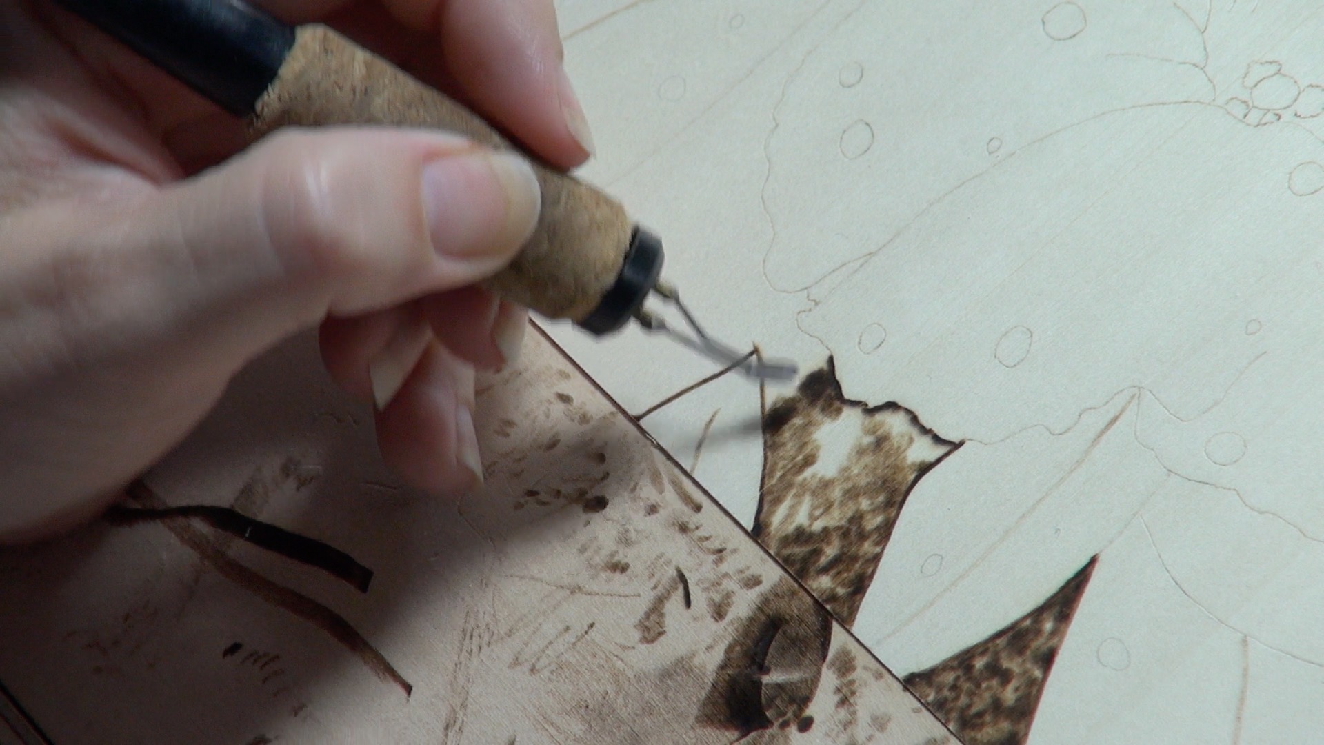
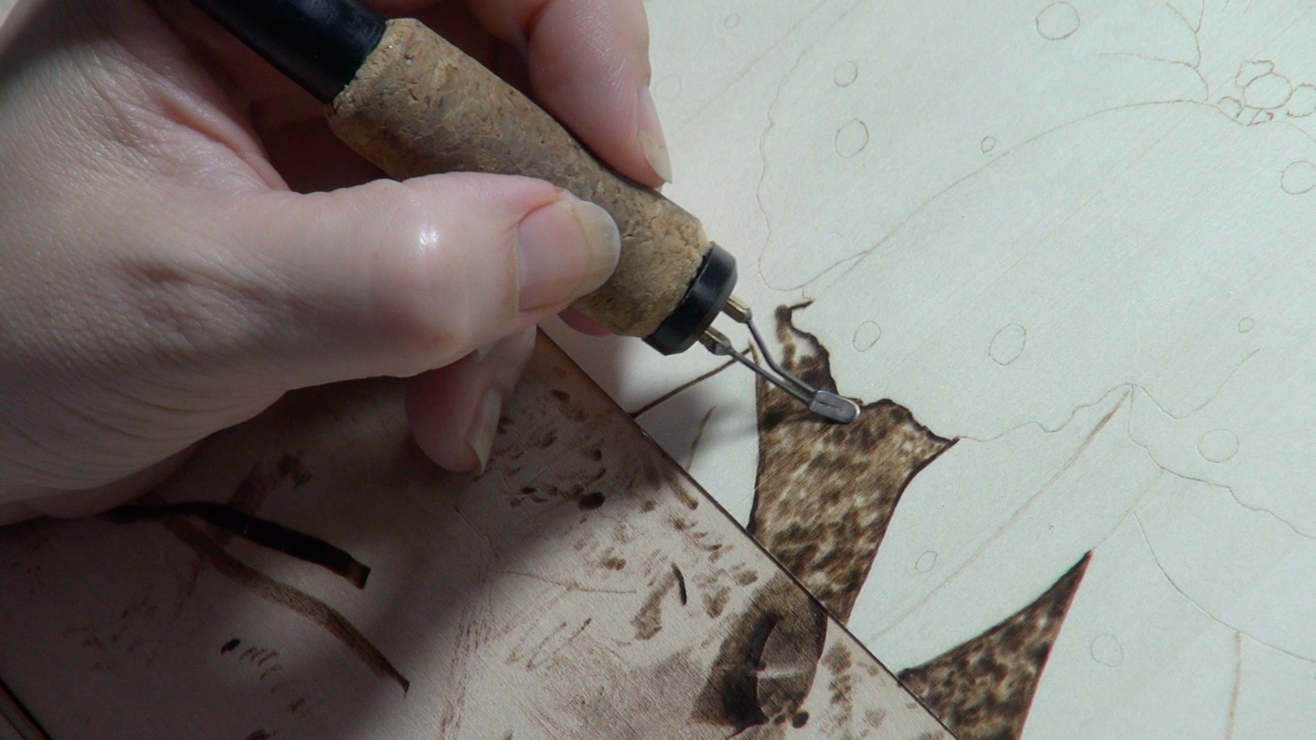
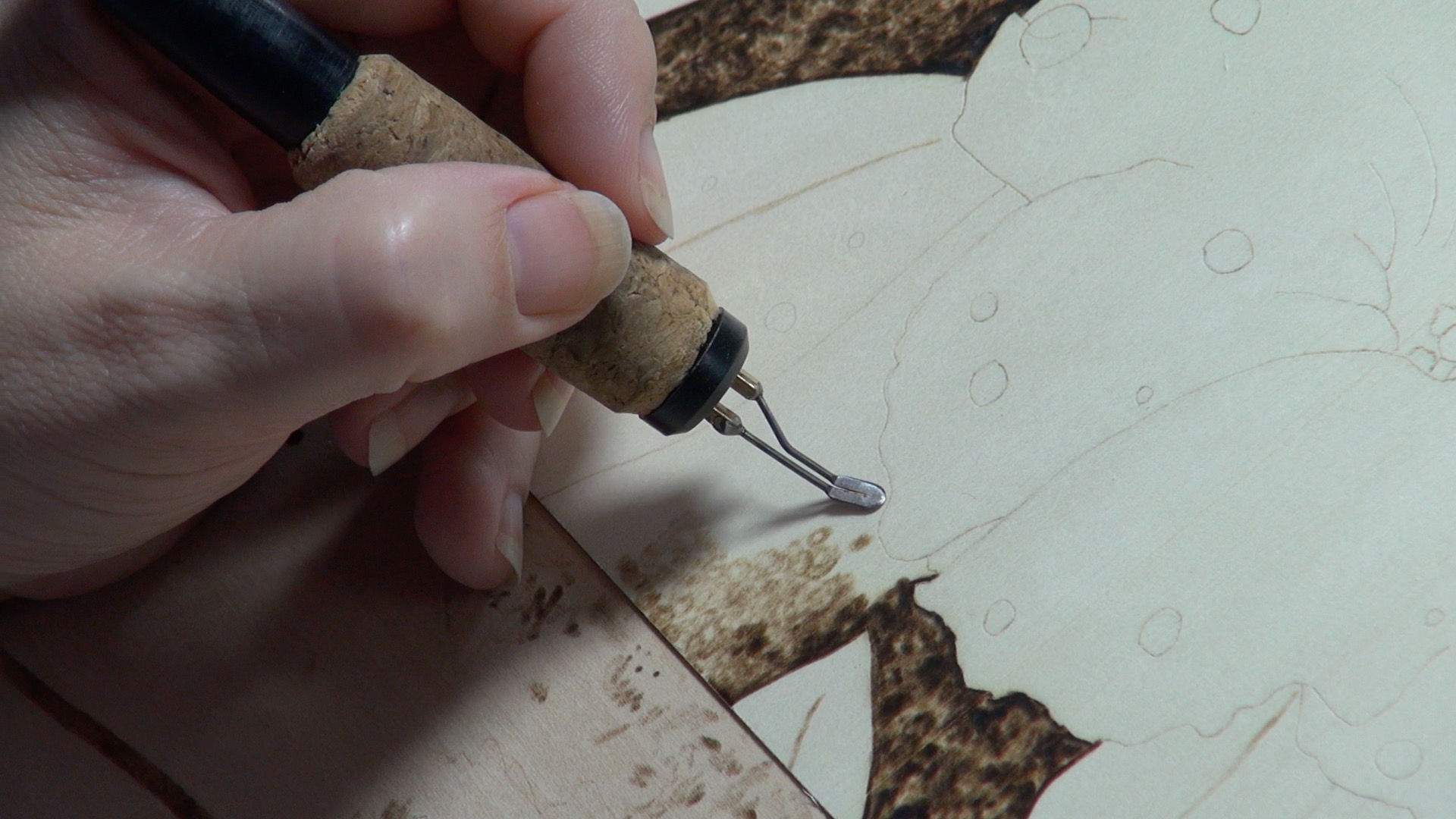
OPTIMAL PEN TIP PLACEMENT – –

Before we start shading, I think it’s important to discuss pen tip placement.
Note the position of shading pen tip in the picture. The end of the pen tip is on the outside edge of the flower petal. Positioning the pen tip this way ensures that I am burning on the background and not on the flower. I call this the optimal pen tip position.
Optimal pen tip position ensures that you are burning where you INTEND to burn and that your borders are crisp/clean.
Turning the wood, when needed, is important to ensure optimal pen tip placement. You can angle your hand in weird positions to accomplish this, but if you’re burning for any duration of time it’s much easier to just turn the wood.
Background Step 1 – Define the area

Defining the area is nothing more than burning a dark line to indicate where the shadows and/or dark background will go. It provides a little bit of a buffer and that makes it easier when filling in the leaves because you don’t have to be as careful when you get close to the edges of the flower petals.

While doing this step I didn’t worry about keeping the defining line a uniform thickness.

As you can see from the photo I also defined the area around the leaves. Again, this is to provide a buffer so that when I burn the mottled texture background, I’m less likely to stray into the leaf area.
Background Step 2 – Mottled Texture

My background texture has a very mottled appearance with its dark and random texture; added bonus is that it’s very easy to create.

1) Fill in a small area with a short rows of small circular shapes that are light to medium tan in color. As you can see in this photo, the shapes are not all the same size and some have white centers. Basically I’m drawing circles and occasionally filling in the circle making a big dot. Another thing I’m doing is making short lines of circles and there are little gaps between the lines. I also changed directions of the lines.
Shows the area after I was done with step one.
2) After you fill in a section, go over it again making darker circles and dots over the existing circles. Keep in mind that you need to make the new circles and dots in different spots than the first circles and spots. Many of my darker circles overlaps two previously made circles. I also increased the size of some of of the circles.

3) lastly darken in very small areas to create the dark blobs. I call them blobs as they do not have set sizes, shapes, etc. Make sure to leave some pale spots as this gives you that mottled appearance.
Let’s look at some more pictures showing the progress of the background being created.


Again, if you desire you can burn the entire mottled textured background at this point. You do not have to burn this artwork in sections like I did.
Background Step 3 – Burn the leaves
Regardless of whether you burn all of the mottled texture or not, the next step is to the burn the leaves.
When burning the leaves you have to add the shadows other objects cast on them. Looking at the bottom four leaves the leaf 2nd from the right is furthest back from sunlight, so it has shadows cast onto it from the flower and nearby leaves.
For me it always helps to mentally place where the sun is in reference to my subject matter as that influences where the shadows are cast. For example, in this particular artwork my sun was located above and to the left of the flower, so this means the shadows are cast below and to the right. The illustration below visually demonstrates this concept.

With that in mind, I’m going to show in detail how I created a couple of leaves.
Example 1:

First working on the leaf 2nd from the right I’m building up the shadows cast onto the leaf from the flower petals. This leaf is the furthest back, so there is greater distance between it and the flower so it has a wider/thicker cast shadow on it.
Notice how the cast shadows follow the general shape of the flower petal.
I tend to use a small circular motion and some short straight strokes to fill in the leaves. I wasn’t after a perfectly smooth look and find that the small circular motion gives me the look or slight texture that I’m after. I tend to use short straight strokes along edges where it meets up with a flower petal as I’m less likely to accidentally stray into the petal.

Next I started toning/coloring in the opposite edge of the leaf. The shape of the leaf is such that it dips in the center and curves downward along the edges.
When filling in you can use steady straight strokes that follow the contour of the leaf. Or you can use circular motion like what was used in the mottled background. I find I tend to use a combination of both. I’ll do a straight stroke along the edges and then fill in using a circular motion.

Draw the center vein along the length of the leaf. This can actually be done first, but I happened to do it at this stage.
If you look at the photo you will notice I’m using the shading tip for this instead of a writing pen tip. It’s very easy to draw lines with the shading tip by just angling it so that less you are using more of the razor edge versus the flat bottom of the tip.

Color in the top or left side of the leaf a dark tan color.

Color in the lower (right) side of the leaf a medium tan color. The lower or right side of the leaf is lighter in color than the left half because it is receiving more sunlight.

Shape or contour the leaf by darkening up (shading) along the center vein line and along the outer edge. You want to have the shading fade out, so it’s darkest next to the vein line and gets lighter the further from vein you get. Same with the edges, the shading gets lighter the further from the edge. This leaves the center of each leaf half lighter than its edges making it look curved.

Lastly, use the writing tip to draw in very fine vein lines along the leaf. Don’t burn the lines much darker than the lightest part of the leaf. They are just adding a little texture and realism to the leaf, but you don’t want them to dominate.
Example 2:

Now we’re going to work on the leaf 2nd from the left. I burned in the cast shadows from the flower petal. Notice how the shadows mostly follow the shape of the petal.
Next I burned in the center vein line along leaf. If it’s easier for you, use the writing pen tip for this step.

Next shade the right half of the leaf along the edges leaving the center very lightly burned.
Below are some progress photos of me working on this leaf.


Now color in the left side of the leaf.

Here’s I’m working along the edge of the leaf. Since the background is so dark, I don’t worry if I’m also burning a little on the background during this step.

Nearing completion. The center part of the left half is still un-burned, but notice how I put the really dark shadows on the leaf.
Those shadows represent the cast shadows from the flower petal and the shadows follow the general contour or shape of the petal.
One last thing I want to point out is how the shadows are thinner where the flower petal almost touches the leaf.


SOME MORE WORDS ABOUT THE CAST SHADOWS

So not only are the cast shadows following the contour of the flower petals shape, their thickness size is determined by how close the flower is to the leaf. The further away the flower is, the thicker or wider the cast shadow size is. So this photo of the completely finished section shows how the arches or frills of the flower petals determine the shadow size. Another thing to point is the leaves tend to curve downward along their outer edges, so making the edges darker than the rest of the leaf helps replicate that look. One last thing, in this artwork the right side of the leaf is usually getting less sun than the left, so the right out edge is darker than the left.
Yes I know, art doesn’t seem near as magical when you understand how the assorted illusions are created.
Example 3 (last one):

On this last detailed example, I’m working on the last leaf of the bottom four (far right). Like the others, I burn in the center vein line on the leaf.

Next I started shading the leaf along the right outer edge a medium to dark-medium tan color.

I’m working my way around the leaf building up the color and shaping the leaf with darker tones along the edges to make it looked curved.
Below are some progress photos


You might have noticed that I didn’t burn in the light vein lines. Those can really be done at anytime, but it was after I finished with this leaf that I discovered I completely forgot about the raindrops! OOPS!
Background Step 3 – Create the raindrops
Even though I completely forgot about the raindrops on the leaves until I finished up the bottom 4 leaves, it is fixable. As I showed in my Water Droplets tutorial, it’s very easy to add rain drops after the fact. I will explain the basics of both methods here.
First let’s discuss the basics of creating a raindrop.

- Draw in a roundish shape and burn the line with a writing tip. It does not need to be perfectly round and, as you can see in the photo, mine are not. I prefer to draw in my raindrops with pencil first to make sure I like the shape of them. Pencil is a whole lot easier to erase than burn lines.

- Using a white charcoal pencil, not a color pencil, place the pin point highlight where the sun first enters the droplet. MAKE SURE you keep all of your highlights on the same side and general location for each raindrop. It would look very off to have a highlight on the left for one raindrop and on the right for another. I use charcoal as it resists burning and it doesn’t melt like color pencils will.

- Burn a shadow along the lower edge of the droplet. Make sure you follow the cast shadow guidelines outlined before. If the sun is to the left, the shadow will be to the right.

- Shade in the top part of the droplet. The top or upper edge of the raindrop is the darkest part and the bottom (or opposite edge) is the lightest. Slowly let the color fade away as you work your way towards the bottom of the raindrop.

- Erase the charcoal.

- Burn a line around the dots. This helps increase the contrast and sharpen the edges. That’s it, you’re all done creating a raindrop.
The above steps are used for creating ALL rain drops. The only thing that changes is if you allotted a spot (blank spot) for them beforehand or if you have to create a spot for them.
Method 1 – Blank Spot

In the Blank Spot method, you have left a spot on the area completely un-burned and this is where the raindrop will be located.
A couple have their shadows burned in and the others do not.
I prefer the blank spot method because the bottom where the light hits the back of the drop remains as light as possible; the natural wood color. Plus you don’t run the risk of gouging the wood like you can with erasing.
The downside is that you have to be careful to avoid burning over the allotted blank spots.
Method 1 – Erasing

In the Erasing method, you have completely burned in the object and will erase a spot on the object to put a raindrop. In this case, the object is a leaf.
Using a sanding pen, X-acto knife, or a piece of sandpaper, erase, scrape or sand a small rounded shape on the leaf where you want a raindrop to go. Use gentle pressure regardless of what method you use and slowly remove the color. If using an X-acto know use the flat part of the blade vs the tip as the tip has a tendency to gouge the wood fairly easily.
 For those interested, a sanding pen is a made out of fiber optic cables and is used to remove rust from metal. Make sure it’s for automotive use vs cleaning watches as the type for watches has soft bristles that aren’t strong enough for this application. I found mine on e-bay and it cost around ten dollars.

Here it shows after I’m done erasing the spot. Yes, they are hard to see.
Once you have a spot erased, clean the area to remove any wood dust and do the steps outlined above ‘creating a raindrop’ section.
The benefit of this method is that it’s easier to keep the background uniform when you’re shading/coloring it in the object.
CAUTION – The erasing method works well as long as the object isn’t very dark. A really dark brown or black area is very hard to erase a small roundish shape on. Plus it’s unlikely you’ll ever get the wood to it’s nature color and you run a high risk for creating a depression or divot in the wood.
For more details and tips on creating raindrops read my blog on Water Droplets. In the blog I cover this subject in a lot more detail including what to do if the background is extremely dark.
Below are progress pictures as I continued to work on the background. I needed the background burned in so I could determine how dark I could burn the flower and still have it seem like it was white in color. That is dependent on the contrast between the flower and the background.


Almost done. Just drawing in the tiny fine side veins.
STEP 4 – Shade the Flower

We’re finally ready to do the very last step and that’s to shade the flower. The most important thing to keep in mind is to keep the heat fairly low on your pen. My unit goes to 10 and I had the temperature set at 2. The flower is white in color, so the shading needs to be kept fairly pale to keep it seeming like it is white in color.

I started in the center of the flower defining the darkest and most recessed area of the flower by burning along the lower edge of the upper petals where they disappear into the center of the flower.

I’m lightly building up the color in the center while leaving the stamen white or unburned.

This photo shows how I’ve burned along a couple of the petal seams (where two petals meet) and on one side of an arch. I’m starting to define the prominent features.

In this photo I have lightly shaded the upper left petals. The color is darkest at the bottom and slowly fades as it reaches the top.
I am using a combination of straight strokes and circular motion to fill in the petal. I just repeat these motions several time near the base (center) to build up the color.

The ENDS of the petals are frilled (have lots of tiny arches). To create that impression I burn very lightly between arches, but leave the arch itself complete white (un-burned).
Another way to visualize the frills is to think of them as hills. Leaving the top of the hill pale and shading the sides make the top appear as the highest point on the hill. We’re doing a very similar thing here. I’m shading to the left and right (sides) of a frill (or arch) to make it look like it’s sitting higher than the sides.

Here I’m burning in one of the raindrops. The steps used are the exact same steps outlined in the background leaf section, so I won’t go into detail here. I do want to point out that I used the writing tip for almost the entire process as the drop was pretty small.

Using the writing tip I worked on the stamen by filling them with lots of little dots. Then I made a few darker dots by holding the pen tip in place for just a fraction longer.

On the large center stamen I used the shading tip and lightly colored the entire thing and went around the edges a couple of times to darken them up. The center stamen ended up looking like a globe, which is pretty similar to how it actually looks on this flower. Remember to keep the heat low on your pen.

Stamen are done. I’m sure you noticed that the flower is also burned in a lot more, don’t worry about that as I will explain what I did next.

Continue shading the rest of the flower by slowly building up the color.
The goal is to color the entire flower an extremely pale tan color, but DO NOT color the tops of the frills (arches).

I used long pen strokes that followed the direction of petal growth. The red lines in the guide photo show the growth direction. If I didn’t start the stroke from the center of the flower, I started it from the outer edge. Either way I followed the petal growth direction.

After the flower is colored a ultra pale tan color, start defining the shadows and the sides of the frills. To do this you just burn over those areas again using the long pen strokes in the growth direction. Some spots I burned over 5-6 times to slowly build up the color.
Below are some progress photos.


Notice how as I’m defining the sides of the arches, the top of the arch stays un-burned.


 Lastly we need to finish creating the remaining raindrops. Again, I’ve covered this in detail in other places, so here I’m going to discuss a three raindrops that have some unique features.

- Unique 1 – The first raindrop is resting above a dark vein on the flower. So I drew that line into the raindrop, but noticed how I offset the line. The line in the raindrop is slightly higher or above the vein line. I also put two highlights side-by-side. While this is not absolutely necessary I do like the look of it.

- Unique 2 – The next raindrop is resting on a fold located on the upper right side of the flower. Again this is just a simple matter of offsetting the fold line to replicate how water distorts the view. Notice too how I offset the line so it sits higher than the fold line. Just like I did with the first one. Another thing that makes this raindrop unique is that there is a shadow along the fold, so this needs to be put into the raindrop too. As you can see I did that, but I didn’t bring the fold line or the shadow all the way across the raindrop. I was really trying to emphasize the distortion properties of the drop.

- Unique 1 – Lastly the third raindrop is located right on the edge of a petal. I’m going to sound like a broken record here, but again I offset the edge so it’s higher than the actual edge. Since the background is dark behind the petal’s edge the raindrop reflects that.
IN CONCLUSION
We’re done. Hopefully I was able to explain things and provide enough photos so you could follow along. Better yet, I hope I provided some useful information and that you will try to create this artwork yourself.
I thing I wish I had done differently was how I handled the sides of the wood. I burned the sides of the wood, but it was a last minute decision. Since I wasn’t planning on that I never sanded the sides to make them super smooth. This meant that the sides are a lot courser and the detail isn’t as fine. I really should have taken the time to sand them.
Lastly to answer a few commonly asked questions. This project was burned on basswood, it measures 8 x 10 inches (20.3 x 24.5 cm), and took me almost 14 1/2 hours to complete it. That said, this is not a race or contest. I only put how long a project takes me as I get asked that question a lot. You may get this done faster or slower, but that doesn’t matter. What’s important is you’re doing the tutorial, creating pyrography artwork, and hopefully having fun. Practice makes perfect, or so the saying goes. While I’m not sure that’s true, as I’ve yet to create a perfect piece of art, it will make you a better artist.
Brenda
Aug 19, 2016
Hello,
Yes, I’m using WordPress software for my blog. When I researched how to use WordPress kept coming up as one of the best platforms because it’s easy to learn. I have no experience with any other platforms, so I can’t tell you if it is better than any others out there.
Brenda