 A while back I was asked by Pete, a fairly new pyrography artist, “How can I tell if I’m done with my pyrography artwork?” What a fantastic question and one I didn’t have an immediate answer for. Since that day, I have spent time pondering the question and I think I have 3 ways to help you determine when it’s time to stop burning. The help is in the form of questions to ask yourself about your artwork. If the answer is no to any one of the questions, then you’re not done. I will provide some artwork to show good and bad examples of my guidelines. Plus I will show two ways to fix artwork that didn’t pass the quiz.
QUESTION 1 – MAIN SUBJECT
Is the main subject easily noticed?
 Look quickly at this artwork and tell me what the main subject is. If you’re having a problem deciding the answer, don’t feel alone. At first glance it’s difficult to tell what the artwork is.
 If you are unsure if the main subject of your artwork is easily noticed then ask someone who is unfamiliar with the artwork to look at it and tell you what’s the first thing you notice. If you don’t have someone you can ask, then put the artwork on a shelf and don’t look at it for a few days or even a week. After the time is up, then look at it again and pay attention to the very first thing you noticed.
I asked my husband to look at this artwork and tell me what the subject was. His face was priceless. I could tell he really didn’t have a clue what this thing was and that was even after looking at the reference photo that was sitting nearby.
 Here’s the reference photo I based the artwork on. Notice how easy it is to tell what the main subject is? There is excellent contrast between the flowers and the leaves.
 In this side-by-side composite photo you can easily see that I did a terrible job making the flowers the main focus of the artwork. Once you know what to look for, you can see the flowers, but they don’t stand out very well. Most people would glance at this artwork and lose interest very quickly.
 I don’t have a lot of artwork that isn’t ‘portrait’ style. The image of the Lioness is an example of the portrait style of art I tend to do. The only thing on the board is the lion, so it’s very easy to tell that is the main subject.

What about this artwork?
Hopefully the bald eagle was the first thing you noticed. The eagle stands out because he’s closer in the image and he’s very dark compared to the background. That difference or oddity is what draws the eye to it.
 What stands out in this artwork?
The hummingbird in the lower half of the board does because it is a dark object surrounded by very pale space. The other hummingbird isn’t near as noticeable, but that’s ok as it’s what I intended. The reason is that it keeps a person’s eye traveling around the board longer to see what else is there; flowers, leaves, and another hummingbird.
 Last example. Look at this artwork of a marine and tell me what the main subject is.
If I did my job right, it would be the first visible boat on the dock. The boat is very dark along the bottom, but the top is very pale. The extreme contrast combined with the center placement make the eye notice that right off.
QUESTION 2 – TONAL RANGE
Is there good tonal range and contrast?
All artwork should have a wide tonal range and good contrast in it, but what does that mean?
 Tonal Range is a term used to describe all of the brown hues available in pyrography. White is the palest color on the board and is generally represented by leaving the board unburned. Black is the darkest color you can achieve when burning. Of course between the two extremes a large range of tans and browns can be found. Good artwork should have a wide range of tonal hues including white and black.
 Good contrast is accomplished by having a very pale hue next to or very close by a dark one. All artwork should have good contrast in it.
Don’t enlarge this image. I kept the image as a small thumbnail because I want you to look at the tonal range of the artwork. Hopefully you don’t see a lot of detail on the image. Look at it and pay attention to the tan and brown colors. Is there a large variety of tones or hues? No.
The artwork stays pretty much the within the tan ranges. With the lack of browns, especially dark browns and blacks, the pale areas in the art don’t really stand out. So this particular artwork fails in terms of both tonal variety and good contrast.
 The Christmas Candy Canes has both good tonal range and contrast. The dark holly leaves in the background contrast nicely with the candy canes. Plus the candy canes have a variety of tans as does the ribbon.
 The farmer and the cow artwork is an example of good tonal range. Look at the jeans the farmer is wearing. The creases or wrinkles have pale highlights and shadows on them. The rubber boots are dark, but have a highlight running down the center. This artwork doesn’t have as much contrast as the candy canes does, but it’s not horrible in that regard.
 The Christ of the Mines artwork, on the other hand, is a very good example of contrast. It’s because of the extreme contrast that the statue looks to be popping off the board. Plus the statue has some wonderful dark shadows that also contribute to the contrast. The rocks provide a range of tans and browns, and the subtle shadows on the robe also contribute to the tonal range.
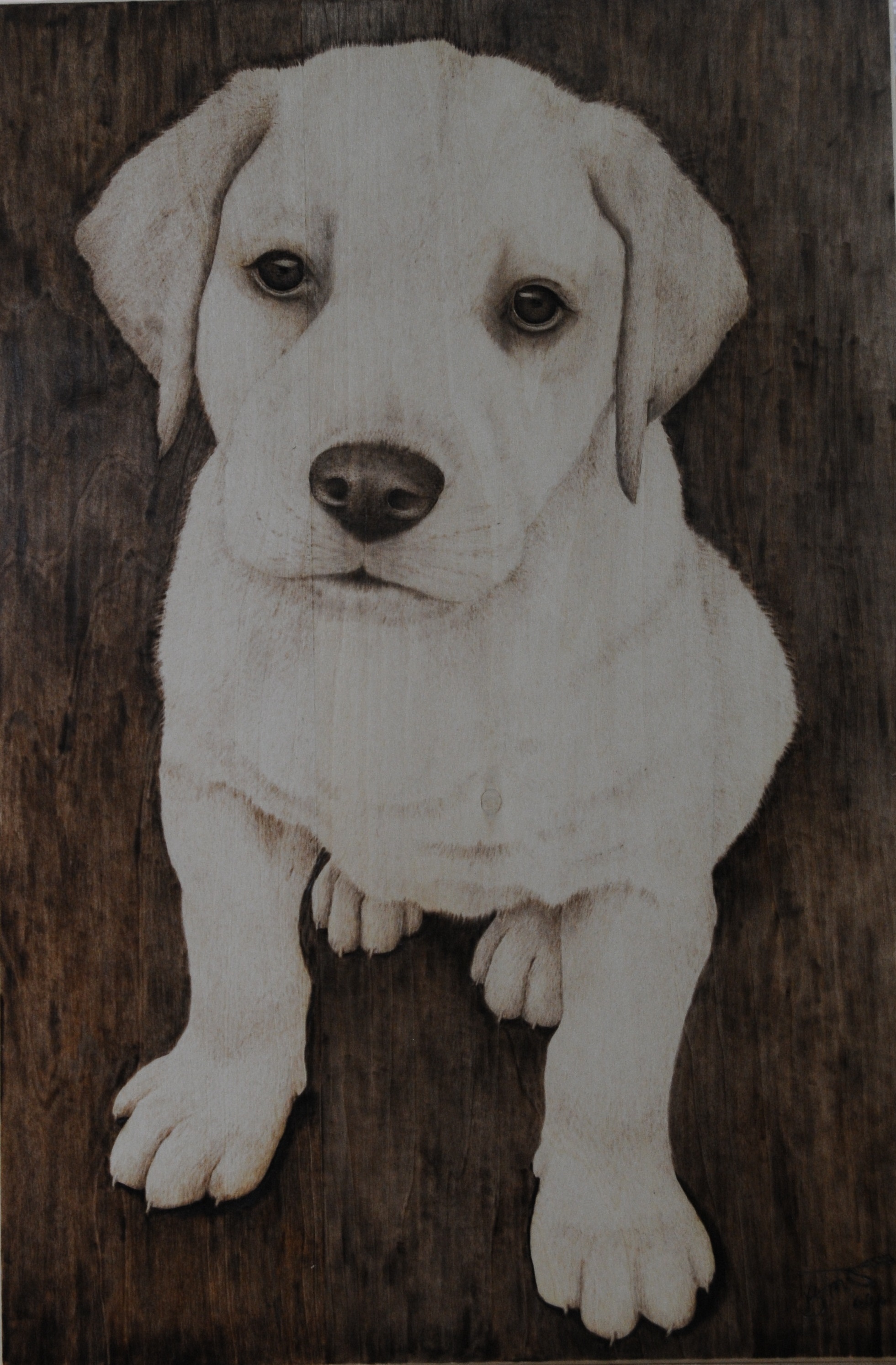 The Yellow Lab Puppy artwork is a tonal fail. There is extreme contrast because of the background, but that has good and bad points to it. The good point is that it really makes the puppy stand out. On the flip side, the bad aspect is that when viewed as a small thumbnail the puppy looks like a white blob with 3 dark spots on it.
 Even though this Iris artwork has a dark background like the puppy did, this artwork still has good contrast and decent tonal variety. The dark background makes the flower pop, and the flower petals have a lot of tans and browns on them. What this artwork could use more of is paler hues.
 This particular Bald Eagle artwork is another failure. There is extreme contrast, but unfortunately the white head is so pale compared to the black background and dark body that it makes it look like the head if floating in space. There is a fair amount on tonal variety, but it is overshadowed by the extreme contrast.
I’ve been studying my favorite pencil artist, JD Hillbery, and learning a number of things. One thing I’ve learned is that background would have looked better as a gradient that was darker on the left side and got lighter on the right.
Why this direction of gradient shading? Because the light is coming from the left. The dark will contrast with the highlights were the light strikes. The right side is in shadows, so by reducing the background color, the shadows on the back of the head would show up better.
 So I decided to test this out using an easy photo editor to lighten up the right side of the artwork. Keep in mind that photo editing is NOT my strong suit. I like how it looks a bit more, but I don’t think it came close to fixing the problems with this artwork. Maybe it would be better if the dark left side was a medium brown instead of dark brown to black in color.
QUESTION 3 – FADING
Do your tans remain after doing a fade check?
Over time, all pyrography artwork burned on wood fades. Ok, that’s not exactly true. Instead what is happening is that the wood is aging, and as the wood ages it discolors which negatively impacts your pyrography artwork.
 This picture shows a board that was sanded on the right side of it. I have no idea how old the board was when I purchased it, but the surface had definitely aged.
Sealing the wood helps slow down this process, but sealants also age and discolor over time.
 Wood absolutely MUST have a sealant to protect it from the elements, moisture changes, and to slow down the aging process. Unfortunately I have yet to find a sealant that remains perfectly clear over time. Most of them impart a color from the beginning and some, like polyurethane, impart considerable color.
 To get an idea of how dark the board and/or sealant will discolor with time, I lightly mist the board with water. It doesn’t need to be a lot of water. In fact, you can rub a damp paper towel over the board to get similar results.
If you didn’t wet out the board BEFORE burning on it, then DO NOT do this step!

The reason is that it wetting the board will raise the nap or the grain of the board. Once it dries the board will be very rough making burning extremely difficult to do over. This photo shows a board that was sanded, and then the right half of the board was misted with water. Afterwards the board was allowed to dry. Notice how rough the right side is? That would not be fun or easy to burn on.
 There is a person on YouTube who recommends using Denatured Alcohol to clean and check your board. I believe the reasoning is that the alcohol evaporates so fast that it won’t raise the nap.
I do not recommend using denatured alcohol because the stuff is toxic! There are a numerous medical problems that can be caused just by the fumes. The health risk is not worth it to me. I’m sure that you can minimize the risk by wearing protective equipment like working in an extremely well ventilated area, wearing rubber gloves, etc., but again for me it’s not worth it.
I’ve attached a link to the MSDS (material safety data sheet) for the product. If you plan to use it, I do recommend you be aware of the dangers so you can take appropriate precautions.
https://korellis.com/wp-content/uploads/2016/05/Alcohol-Denatured.pdf
 This composite photo shows the artwork before and after I misted it with water. This particular board is going to yellow a lot over time.
 What I’m checking for is to see if the lighter tan colors I’ve burned disappear when I mist the board with water. I’ve put yellow circles on the images to point out the area I’m really concerned with. From viewing this photo I can tell that I will need to darken up some of the burn areas on the white section of the duck.

When I did the fade test on the Garden Thief Squirrel, the edges of the tail practically vanished. The fade test revealed the fact that I need to darken up the tail a lot to ensure that it will show up once sealed.
To give you an idea of how aging wood impacts artwork, below are comparison photos of work I’ve done.
 The Eagle Owl is aging pretty good. It was burned on a piece of poplar. The left side of the owl is getting tough to see, but the wings and tree branch still look very, very good.
 The Scrub Jay was burned on basswood and I think it’s aging very well. I’ve lost most of the golden tans around the belly and the subtle light tan on the background.
 Feather is not aging well. I burned it on a piece of store bought die-cut plywood, and I never sealed the wood. The left side of the feather has almost disappeared and overall I’ve lost a lot of the tan hues. Notice how the wood grain is becoming a lot more noticeable.
 Vista House is another piece of artwork that is aging very poorly. This was was burned on a piece of wood that was cut off a large sheet (4 x 8) of birch plywood.
 Plus the is yellowing a lot. I had to angle the art around before my camera captured what my eyes could easily see. Plywoods are the worst for aging. I still burn on them because they are inexpensive, but I wouldn’t do commissioned work on plywood.
 The Lotus Goddess was burned on basswood, so it should have aged well but it’s not. There are two reason for this. One I didn’t burned the side of the robe well enough to make sure they would pass the fade test. Secondly, this is the only piece of artwork sealed with polyurethane.
 The polyurethane coating is really turning a yellow color and it’s a lot easier to see that on the sides of the board.
 Keep in mind that doing the fade test only applies to wood. My demo artwork for this blog was burned on paper; Strathmore, acid-free, 100% cotton, 140lb (300 g/m) paper to be exact.
High quality acid-free paper will not fade as long as you keep it out of direct sunlight. Direct sunlight will damage the paper and generally discolor it a yellow color which will impact your artwork.
In fact, all artwork should be placed so it does not receive direct sunlight as UV rays will age and discolor most objects over time.
FIX IT
Now let’s discuss the two ways to fix the artwork so the main subject is easily identified and to gain good tonal variety. The two ways are adding color and reburning. We’ll start with adding color.
ADDING COLOR
 The first way to fix easily is to add color. On this print out of my artwork I used color pencils to add color to the flowers. Now the flowers really stand out, but does that fix the poor tonal variety? It can be hard to tell when looking at color, so let’s convert the photo to a black and white image and look at it that way.
 Looking at the artwork with the color removed shows that not much has changed. The large open blossom might stand out a little more, but not much more and the flower buds to the side are barely noticeable.
 To fix the background I used a sienna brown colored pencil to start coloring over the entire background. In this photo you can see where I’ve applied color and where I haven’t.
 Look at the black and white version of the photo. Now the flower buds are standing out, so coloring in the background is helping emphasis the main subject of the artwork. This lets me know I’m on the right track to fix the main subject issue.
 I’ve got the entire background covered with sienna brown with the exception of the lower left leaf. I decided to leave that alone.
 When I convert the image to black and white, I discovered that I fixed my main subject issue, but the tonal variety is still terrible. I do like how the flowers are now easily identified as the main subject.
 To fix the tonal variety, I switched slightly darker brown color and started working on the areas that need to be darker.
 The colorless version of the photo shows the positive impact my coloring is having.
 With this last photo, I used a dark brown color and really built up some of the dark shadows. The artwork seems to have good tonal variety and contrast, but again it can be hard to determine when judging color images.
 After converting the photo to a black and white image, you can easily evaluate the tones. Things look good. The flowers are easily identifiable as the main subject, and there good contrast and tonal variety. I did one final check and looked at the image from across the room (or make it really small on the screen), and I could see a lot of tonal variety and I could see the flower. Granted it wasn’t in sharp detail, but I could still see it. Now let’s use reburning to fix the artwork.
REBURNING
 The first thing I’m doing is rubbing over the outer edges of the flower petals with an ink eraser to try and lighten them up a little.
 Here’s how it looked after I was done. There isn’t a huge difference, but I didn’t want to damage the paper.
 Then I started reburning the areas that should be really dark next to the flower blossom.
 This photo shows the artwork after reburned over left side of the image, but I did not burn over the large leaf in the lower left corner. Just this little bit of reburning already makes the artwork look a lot better.
Look at this composite photo comparing the left side of the artwork before and after I re-burned it. The left side is very boring looking. It looks abstract and blasé. The right side has visual interest and you can start to pick out objects.
 I went back to reburning over the artwork placing emphasis on the areas that should be dark.
 Continued work.
 After I re-burned the background to increase the contrast and tonal variety, I reburned over the greenery on the flower blossoms.
 The last thing I did was lightly reburn over the lower left leaf. I especially wanted to tone down the pale center of the leaf as it was almost as pale as the flower.
 This is how the final artwork turned out. This image has great contrast, tonal variety and is visually interesting. This is something that will catch a person’s eye and keep it.
 Here is a final comparison photo of the artwork before and after I re-burned over it to restore the main subject and increase the contrast and tonal variety of the artwork. I like the after photo, but I can’t say that about the before image.
There are numerous photo editors free to use online. I have not tried any of them, but Richy Coelho does and has tutorials demonstrating them. Click on one of the images to watch the YouTube video. The first video covers the basics of using a photo editor. The second video explains how to use a free online app to create a composition from multiple images.


IN CONCLUSION
I hope this blog helps you with your artwork. While my questions might not apply to every scenario, I think that they do for the majority of artwork. If nothing else I think this blog showcases the positive impact of extreme contrast and good tonal variety can have on your artwork.
Until the next blog,
Brenda
Sep 20, 2019
Want to subscribe?
- Click on the “Leave a Comment” field at the end of any post (blog) and a subscribe option will appear.
- Put something in the comment field (if you put “test” or “just subscribing” I won’t make your comment public)
- Fill in the sections for your email address and name, and then click on the “notify me of new posts via email.”
- You will get a confirmation email from WordPress confirming you want to subscribe.
- Click on the confirm button in that email and you’re done.
Please note that I do not send out emails. If you have a WordPress account there is a way to subscribe within the WordPress system, but I cannot provide specifics on how it works as I don’t know.
Thank again Brenda, you have so much helpful information. I am very grateful for all of it. Still trying to figure out my project however the information on here is very helpful. Call me strange but I like the yellowing of some woods. To me it looks antique and I really like the look. My brother bought a piece years ago with that antique look. I hope I can get my pieces to look like that one day. Thanks again for your help .
No need to apologize as variety is what makes the world interesting.
Polyurethane finish will impart a very yellow hue to the wood that might give it an antique look you like. Polyurethane is also one of the most durable finishes available and one of the most smelly. I’d recommend testing it out on a piece of scrap wood to to see what you think about it.
Hi Brenda. Can I first of all say that I am fixated by your website. Looking for a hobby that I thought I might enjoy, I purchased a pyrography kit 3 weeks ago. Unfortunately it was not a good experience. The kit I bought was cheap and came with a selection of tips but it also came with a major problem. During use, the converter tube and the tips keep on coming loose. I guess its true what they say, you only get what you pay for. I have since ordered a new kit which is more up market and hopefully will have a better experience when it arrives. I continue to visit your website and am inspired by what you do
Hi Bill,
First off, welcome to the artform of Pyrography! It really is a wonderful medium to work in.
That sucks that your first kit wasn’t very good. I’m glad you decided to get another and try again. Hopefully it will be much better and you can enjoy creating pyrography artwork.
Thank you for your comment and have a wonderful day!
Brenda
you are amazing to watch woodburning and I hope I can learn a lot from you
Hi Doug,
thank you. Pyrography is a lot of fun and I hope that you will enjoy the artform.
Brenda