
In this tutorial I’m going to explain how to create the dog with curly white fur. Please keep in mind that while this subject may seem a little intimidating at first, it’s not that bad once you break it down into smaller pieces. Breaking down the project into smaller more manageable pieces is what I plan to do with this tutorial blog. I think that if you have a little burning experience, you’ll be able to follow along with little to no difficulty.
To save time on writing and reduce the number of pictures, I will only explain half of the dog. This means that I will explain how to burn in one eye, and you need to apply the same steps to the other eye. Same with the ears and a good portion of the fur. The fur is just a repetition of the same basic steps, so there isn’t a need for explain the same thing over and over.
 Click on the image to the left to watch a YouTube video version of the tutorial.
 To watch a time lapse video of the artwork being created, just click on the image to the left.
Now, let’s get to work.
SKILL LEVEL: 3
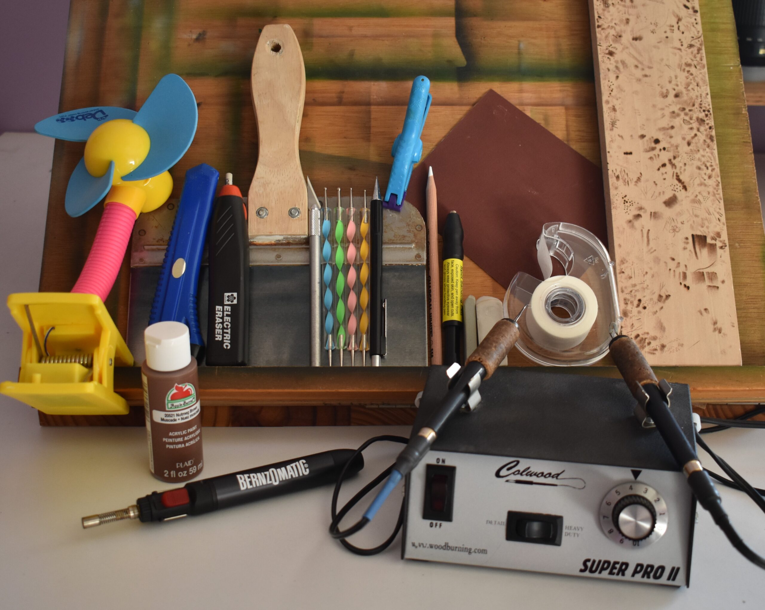
MATERIALS NEEDED:
- Writing tip
- Shading tip
- 5 x 10 inches (12.7 x 25.4 cm) piece of wood
- Ink pen eraser
- White colored pencil (optional)
I did not create a pattern for this artwork. I think this is a situation where you will learn more by tracing the dog for yourself than you would by using a pattern I created.
STEP 1 – PREP THE WOOD
 Wood burning is much easier if you take the time to prepare the wood surface. Always smooth the wood surface by sanding it with at least 220 grit sandpaper.
 Then thoroughly wet the board by misting it with water or running it quickly under the sink faucet.
 The board should be damp to the touch, but not soaking wet.
Let the board dry and then sand again.
 This piece of plywood board is broken up into three sections. The far left section is how the board looks without any prep work. The board has a rough texture. The middle section of the board shows how it looks after it was sanded, and the surface is a lot smoother. The right section of the board shows it after it was lightly misted with water and allowed to dry. Notice how rough the board looks, but a quick sanding will remove that and leave an ultra-smooth board.
Doing the 4-step process (sand, mist, dry, sand) produces a super smooth surface, and the smoother the surface is the better the burn results will be.
STEP 2 – PHOTO ANALYSIS
 Here’s the reference photo. I’m going to cover the things that I notice about the image in an effort to help you see different aspects of the photo that stick out to me.
I obtained this photo from Pixabay. Here’s a link to the original photo: https://pixabay.com/photos/dog-bichon-frise-bichon-4679006/
 First off let’s do a general observation by noticing how in focus the face is compared to the rest of the body.
 If you examine the front leg, you can see that the toe area is in decent focus, but the fur quickly goes out-of-focus. This gives you a soft lumpy looking texture. The color of the fur is slightly darker than the in-focus face area.
 Examine the rest of the body and you can see that it is very blurry. You can also see the color of the fur is darker than the front leg.
 The facial features are the focal point. The focal point is the spot we want the viewer to notice first. We will help ensure this happens by giving the face the most contrast. Plus, we’ll make sure the fur is clearly defined.
 Look at how much depth is in the face. The snout really sticks out from the eyes. Why?
Look at the yellow arrow. It is pointing to pale fur.
The black arrow is pointing to the darker fur around the eyes. This combination of light and dark fur creates contrast that really pushes the darker color into the background.
 Speaking of darker color, the face has 3 areas of very pronounced darker color; under both eyes and below the nose.
 Now lets really examine the curly fur. Notice how the fur is formed into numerous curly locks. With most, if not all, of the locks we only see the top portions. The bottom of the locks where it attaches to the skin is in shadows. Another way to look or think of this is that we have a bunch of wide pale curving lines surrounded by shadows.
 The other thing I want to point out is the background. The right side has a wonderful really dark background that makes the pale, clearly defined fur stand out. The left side is much lighter in color and the edges of the fur are very soft. The pale color combined with softer edges helps push the dog’s body into the background giving the image more depth.
STEP 3 – TRACING
 Print out the image on lightweight copier paper and coat the back of it with a thick layer of graphite. The secure the printout to the board and trace the image.
 Then start tracing over the image. I am tracing around the edges of each lock of curly fur.
 With the out-of-focus areas, I’m just tracing along the contours or outer edges of the shapes.
 I also traced around a couple of the highlights found in the area.
 Always look for missing information before you remove the pattern and/or tracing printout. It is rather difficult to line up a pattern to its original placement once it has been removed from the board.
 This shows the image before and after I traced over it.
 Here’s my trace lines turned out, and they are a bit darker than I like. The problem with them being so dark is that when I burn over the trace lines the graphite will get pushed down into the bottom of the burn lines. This will make the graphite harder to remove. I don’t want that problem.
 What I do to fix this is gently swipe a kneadable eraser over the lines.
I do not RUB the eraser over the lines!
Instead, I start at the top and swipe down towards the bottom in one pass. Then I move to another spot and repeat. After a few swipes, I knead the eraser to “clean” and repeat.
 Swiping will remove some of the excess graphite, but not obliterate the trace lines.
 Here’s how the trace lines looked before and after I removed some of the excess graphite.
At this point you need to lightly burn over the trace lines using a writer pen tip. Then rub over the area with a standard pencil eraser to remove any residual graphite. I did not record this step.
STEP 4 – THE EYES
 Let’s start with the eyes and the fur adjacent to and directly below the eyes.
 Begin with a writer pen tip and burn around the contours of the eyes.
 Burn in the pupil to a dark color, but avoid the highlight.
 Switch to a shader and fill the eye with gradient color. The color should be darker at the top.
 Darken up the lower eyelid and burn a bunch of really thin lines adjacent to the lower eyelid. The thin lines start the transition from visible skin to fur.
 Lightly burn along the bottom edge of the eye. I am purposely burning the eye to a much lighter color than the reference photo. The reason is that I don’t like how the eyes look like black buttons in the photo. I want them to have a little more life and character.
 Rotate the board as needed to keep your pen tip in optimal position while burning around the edges of the hairs that hang down over the eye.
 Here’s a progress photo.
 Now start darkening up the fur directly below and to the side of the eye. I’m using the flat of the shader to burn a wide dark tan band of color adjacent to the eye.
 Next, start burning over the rest of the fur directly under the eye, but leave a few locks very lightly burned for variety.
 As you can see, I’m burning around a few locks of fur.
 Next, burn over the fur again, but this time burn thin lines that follow the curve of the fur.
 Darken up the fur around the locks that overlap onto the eye.
 Work along the inner corner burning around the locks of fur found there.
 Work slow and keep your pen tip in a low setting. The slower you work, the lower the heat setting should be.
 Finish burning in the curved lines on the fur right under the eye.
 Here’s another progress photo.
 Now that the fur under the eye is blocked in, it is time to darken it up.
 This means we will re-burn over the shadows we’ve created and reduce the pale colored locks. Again, I can’t emphasize enough the need to work slow.
 It might be easier to use a writer pen tip to darken up the thin shadows near the eye.
 I also used the writer to further define the stray locks to the side and above the eye.
 Right now the shadows probably looks like they are too dark, but don’t worry. Once the rest of the fur is done the shadows will look fine.
 You can also use the writer to create dark shadows in the curved fur.
 Darken up the shadows and further define the wispy locks of hair around the eye. A reminder that even though I’m using a shader, you can use the writer pen tip. Use what is easiest for you.
 Continue to darken up the curved fur below the eye.
 Make sure that the top and bottom edges of the fur are darker than the center.
 Finishing up
 If needed, use the edge of a sharp knife to clean up the reflections in the eyes and restore any wispy hairs that got burned over.
STEP 5 – THE NOSE
 Now let’s burn in the nose
 I like to work on the dark areas first because it helps me match up the artwork with the reference photo quicker. The nostril openings are the darkest area on the nose, so that’s where I started.
 Then burn over all of the nose making sure to add some dark lines under the wispy hairs that lay on top of the nose.
 The bottom of the nose is also pretty dark.
 Continued work.
 Burn adjacent to the dark opening on the bottom half of the nostrils. This will create a little highlight along the edge, but keep the edge soft not crisp.
 It takes me several times re-burning over the nose to build up the shadows and overall color of the nose.
 Carefully burn around the locks of hair that lay on the top of the nose.
 If you should burn over one or two, just use the sharp tip of a knife and gently scrape the lock of hair back into existence. If you’re burning on plywood like I am, be careful not to scrape through the top layer of plywood because that would expose the glue layer below it.
 Darken the shadow on the lower portion of the nose and continue the darker color up between the nostrils.
 Switch to a writer pen tip or a small ball tip and apply a layer of tiny dots over the entire surface of the nose. This is an optional step. I like the texture it creates, but not every does.
 Here’s a progress photo of the nose.
 If needed, re-burn to darken up the shadowed areas. Re-burning over the nose is a great way to make to reduce the appearance of the tiny dots; making them a more subtle texture. I’ve had to do this on other projects where I burned the dots a touch too dark.
 Finishing up.
STEP 6 – THE MUZZLE
 In this step we’ll take care of the muzzle or snout. Actually, the muzzle includes the nose which we already took care of. Instead, we’re going to be burning the fur around the nose, and around the mouth.
There is a basic process to the fur.
1) burn the area around an individual curling lock of fur.
2) lightly burn over the curling lock of fur.
3) reburn over the base of the curling lock of fur.
4) examine the lock and determine where is the lightest area on it as that will tell you if the end or tip of the lock needs to be darkened up. Let’s look at the reference photo for examples.
 The yellow arrow is pointing to a lock of fur that the end or tip is lightest area. That’s because the end of the lock of fur is sticking out.
The black arrow is pointing to a lock of fur that the end bends or tucks back down towards the skin. This means that the spot where the lock bends or curls sticks up the most, so is the lightest area on the lock. The majority of the locks are similar to the lock the black arrow is pointing to.
For locks like the yellow arrow is pointing at, you need to leave the tip or outer end of the lock unburned or very lightly burned.
For locks that curve inward or down away from the light (black arrow example), you need to re-burn over the end of the curling lock of fur, so that the bend is palest area on the lock.
 Pick a spot on the top of the muzzle and start burning the area around a lock of curling fur. I will warn you now, I bounce around a lot in this section.
Ignore the pencil line running down the center of the face. I had originally planned to make this a two-in-one demonstration. The first part of the demonstration would be creating the white fur. The second part would cover how you could shift the color to make the fur brown. Once I started working on the fur, it didn’t take long before I decided to keep things simpler.
 Continue to burn around individual locks of fur. Basically, we are darken up all of the fur except the upper three-quarters of the locks. This will make those pale locks appear to be sitting up from the rest of the fur.
 In some areas, like the bridge of the nose between the eyes, the fur has locks that curl and we don’t see the end or tip of the lock. That’s not a problem, just treat them like the locks pointed out by the black arrow.
Also, since the locks of fur aren’t as clearly defined in this area, I use flat of the shader to burn around the individual locks. This will give them slightly softer edges and that will replicate what we see in the reference photo.
 After blocking in a section of lock, darken up the locks along the bottom edge to give them depth. We’re darkening up the bottom edge because the light is coming from the upper right.
 Continued work.
 This section of fur just above the nose is probably the most difficult section because it is the point where there is a lot of fur direction change.
If you compare my artwork with the reference photo, you’ll see that I added a number of clearly defined locks of fur on my artwork in this area. I preferred the look of curling locks versus what the reference photo shows.
When working on difficult areas, I find it helpful to take frequent breaks. During the break I work on a different area on the dog. The reason I find it helpful, is that after a bit you’re eyes seem to get numb to the details. When I take a break and look back at an area, I see the details better.
That’s probably not the best description for what’s going on, but it’s what came to my mind.
 For me this method of working in a spot and then moving onto another spot seems to work well. You will have to try it and see if it works for you.
 Take your time. I won’t say that this project is super easy, but it’s very doable if you break it down into small sections. Don’t rush to get the job finished quickly. That is just an invitation for mistakes and disappointment.
 Work your way around the muzzle burn in the fur around the curly locks of fur that stick up from the nose surface. Then examine the curling lock and decide how it needs to be burned.
 The dog in the reference photo has some rather dark brown streaks on the edges of some of the locks around the mouth. I am choosing to ignore most of them. I’ll explain why in the next paragraph.
 Looking at the color reference photo, you can see that the dog is white with black skin. The brown streaks look brown because they are a different color.
With pyrography we only have shades of brown to work with. So I figured that the dark streaks would end up looking like shadows in the artwork.
Some of you often ask why I don’t work with black and white photos. Mostly it’s habit and preferences. I personally think that I see more of the subtle details when using a color reference photo. That said, do what works best for you!
 Even though we are only working on the muzzle in this step, you can see that I’ve done work in other places. Like I said before, I bounce around when I’m burning. I’ve seen artist who can start on one side and work their way to the opposite side. I have done that, but it makes the process less fun for me. This is just another item we can chalk up to personal preference.
 Each time I come back to the multi-direction fur on the nose, I define a few more locks of fur and darken some of the shadows.
The locks of fur are thinner here and some of them rest on the nose. This also means that some of the darker shadows are very thin. Since is a very in-focus area and part of the focal point, we need to make sure the edges around the locks of fur are very crisp and clean.
 I don’t work long on the multi-direction fur area before I moved onto another area.
 With the fur on the upper lip, burn a series of thin lines that follow the curve of the fur. This will give the area texture, and create definition between the locks.
 Burn a series of short thin dark lines adjacent to the sides and bottom of the nose. It is okay if the lines overlap a little onto the nose. We are creating the transition where the fur starts to cover the skin. The thin lines represent the start of individual strands of hair.
 Here you can see that I’ve burned fur above the lip so that the center is lighter than the edges. This is the major reason the fur looks like it is curving. The lines provide shadows and create the illusion of individual locks or clumps of fur.
 Continued work.
 The fur on the lower lip or jaw is short, but it does have a slight curve to it, so it gets the same treatment as the fur on the upper jaw.
 The right side of the muzzle is blocked in, so now I’m beginning on the left side.
I use the same steps I have all along, so I start out by burning the fur around the curling locks. Another way of thinking about this, is that I’m burning the shadows or darker areas of the fur around the pale curling locks of fur.
As I said before, burning the shadows in first makes it easier to see what is going on with the artwork. At least I think so.
 The fur that is closer to the eyes has thicker locks of fur and the shadows aren’t quite as dark as those close to the nose. The reason is that we’re seeing more of the dark skin near the nose.
 I re-worked the fur around the mouth numerous times. Each time I darkened and further defined the individual locks of fur. If you’ve ever read one of my cat fur tutorials, then you know that I add many layers of fur build up the color and texture. The same principle applies here. The major difference is that I can’t add too many layers of color otherwise the fur won’t look white anymore.
 Hopefully you’ve noticed how dark some of these shadows are getting. Overall, the fur still looks white, so we’re okay.
Also notice how the eyes are looking recessed compared to the muzzle. That is the power of contrast. The muzzle has paler fur, so it appears closer to the viewer than the darker fur does.
 The light is coming from the right, so the left side of the muzzle is slightly shadowed. This just means that all of the locks of fur should be a shade or two darker than the right.
 Continued work.
 Continued work.
 Another to keep in mind is that the fur along the bottom of the muzzle will be darker than the top. Since the floor will be considerably darker, we can burn the shadows to a dark tan or even very light brown and the fur will still seem white. In this area it will appear as white fur that is in shadows.
 Again, take your time. This isn’t a contest to see how quickly you can finish the artwork. Instead, this is about improving your realism skills.
 Back to working on the multi-directional fur. I didn’t keep track of how many times I worked and re-worked the area, but it was at least 6. Mostly I worked on the tiny dark shadows that appear in and around the furs.
 Once the all of fur is block in, then it is time to darken up a few shadows.
I like to create a couple of fairly dark shadows to help give areas further depth, and add more tonal variety to the artwork. It also makes the fur appear thicker.
 I also added more thin lines along the fur around the nose.
 In this photo you can see that the left side of the muzzle is slightly darker than the right. It’s not a huge difference, but it does help convey the fact that the light is coming from the right.
 It might be helpful to use a writer pen tip to work on the shadows around the multi-direction fur.
 You can use it in other areas too.
STEP 7 – THE FACIAL FUR
 Now let’s work on the rest of the facial fur, so we’ll work on the cheeks and forehead.
 The fur on the cheeks needs to be softer and darker than the muzzle. It is the combination of darker color and softer edges contrasting with the brighter and crisper muzzle fur that give the face depth.
 When I say the fur needs to be soft, by that I mean we don’t want a lot of clearly defined locks of fur.
 To make the edges of the fur softer or less crisp, burn around the locks of fur using the flat of the shader. Most likely you will over burn onto the lock of fur, but that’s ok because it will further soften the area.
 There are locks of fur that curve, but don’t stick up much from the skin surface. One way to visualize what I’m talking about is to think about an arch. The center of the arch sticks up higher than the edges, and that is what some locks of fur do.
To make these lock look curved or arched is a matter of burning along both edges of the lock. Or to put it another way, the center or middle of the lock is lighter in color than the edges.
 After making a thick lock like this one look curved, I will add thin lines to break up the lock a bit. Often the lines are subtle.
 Here’s a progress photo. Notice how some of the locks are nothing more than vague highlights or pale areas.
 For a lot of the burning in this area I used circular motion.
 If you should get a crisp line, you can easily soften it up by burning over the line using the flat of the shader.
 As you are burning in the cheeks, make sure you burn them so they are a couple of shades darker than the fur on the muzzle.
 The fur above the eyes is brighter and more defined than the cheeks. Treat the fur in this area the same way we did the muzzle.
 Each new section I work in, I begin by burning the area around the locks of fur.
 Then I examine lock to determine where the brightest spot should be. Basically I’m looking to see if the end of the lock sticks up away from the skin, or curls back down towards the skin.
 Once you get some of the fur burned in, I think you’ll be surprised at how much easier this is than it seemed like it would be.
 Make sure to burn the shadowed area around the locks dark enough. I’d recommend a dark tan color.
This will help make sure the locks stand out, and help the artwork look good as it ages. One of the biggest mistakes I see people make with white fur is not including enough shadows. Or the shadows are so pale that you don’t notice them.
If you block out everything but just the face on my artwork, you’ll really notice how dark some of the shadows are. The only thing to keep in mind is that really dark shadows need to be small. That way they won’t stand out too much. Also, keep then lighter in color than the nose.
 Continued work.
 Keep in mind that you can burn in the shadowed areas around the a number of locks, and then take care of the locks. Or burn around a lock and take of it as you encounter them. Either way will produce great artwork. I just want to make sure you know that the exact order steps are done in isn’t that important.
 I will admit that I vary my approach to the fur. I sometimes burn in all of the shadowed areas, and then burn the locks. Other times I burn the locks as I encounter them.
Why do I alter how I approach the fur? I have no idea.
 All of the curling locks of fur directly above the eyes are in focus, so give them clearly defined edges.
 In fact, the fur stays clearly defined until we near the top of the head. At that point the fur starts to go slightly out-of-focus. I consider it the transition zone between the clearly defined face fur and the out-of-focus body fur.
 In this photo I’ve burned the shadows around a number of locks of fur. Notice how the color is not uniform. Make sure to incorporate variation into the shadows. I’m using circular motion as my burn stroke for this.
 Here’s another progress photo.
 This is the area where the fur starts to lose its crispness. To create soft edges, burn around the locks using the flat of the shader.
 Finishing up this section.
 After I was all done burning, I used the edge of a sharp knife to scrape some highlights on a few of the locks.
 Then I got the brilliant idea of using a white colored pencil to create the highlights. That was a facetious statement.
I will honestly admit that I didn’t like the addition of the colored pencil. Since this was a demo, I left it in place. I’ll show a before and after picture near the end of the blog.
I cannot emphasize enough that you do not add colored pencil until all of the pyrography is done! You do not want to burn over colored pencil. The reason is that the wax will melt and the pigments while char from the heat of the pen tip.
STEP 8 – THE EARS
 Now it’s time for the ears.
 I’m only going to explain the right one.
 The ears are in focus, so treat them like the fur above the eyes and around the mouth.
 The only slight thing to keep in mind is that the ears have more shadowed where they touch the face. Also, the upper portion of the ears are lighter in color than the bottom.
 Other than keeping the shadows in mind,, the ears are pretty straight forward.
 Just take your time and burn carefully around the locks of curling fur. For whatever reason, there are a lot more clearly defined locks of fur on the ears than the face.
 Continued work.
 There is one other thing we need to do, and that is add some thin wispy hairs along the outer edge of the ear.
 To do this, just use the razor edge of the shader to burn dark thin lines along the ends of some of the locks to break them up. You can also use a writer pen tip for this. Yes, it helps if the background is burned in. Or at the very least, a wide border next to the ears is burned in.
STEP 9 – THE BODY
 Now let’s work on the fur on the body. If you look at this photo you can see that the hind leg is complete. The hind leg is cut off in the reference photo. I just sketched a basic leg shape to fill in the area because I had room on the board I was using.
 We’re start above the head. Burn around the few locks of semi-defined fur using the flat of the shader.
 I am using circular motion almost exclusively in this area.
 Most of the body is very out-of-focus, so all we see are highlights and shadows that have very, very soft edges. Circular motion is great to creating soft edges, and that’s why it is my primary burn stroke in the area. I might use some uniform strokes here and there, but not a lot.
 The soft highlights and shadows can be represented by burning small roundish or oblong shapes that vary in color.
 There are a couple of locks of hair along the transition zone that are slightly more defined. I traced around those, and I use the flat of the shader to burn around the tracings. Again, it is important that the locks do not have crisp edges.
 2h5. There are two important things to keep in mind while working on the body.
1) The overall color needs to be darker than the face and ears. This darker color will help push the body further into the background.
2) Don’t create areas of high contrast in the body. This means keeping the color scheme within a narrow range of shades. I kept my color range in the medium tan to very light brown range. Avoid super pale and super dark colors on the body. This will help ensure you don’t create competition with the focal point.
 As I continue to work along the transition zone, I want you to really examine the body. Notice how the shapes are vague with soft edges.
 Here’s a progress photo. Compare the contrast difference between the fur on the muzzle and the body. The muzzle has brighter highlights and darker shadows. The body is more muted; the color difference isn’t as extreme.
 Continue to work the fur along the body.
 There is another area where the overall color of the fur gets even darker, and that’s where the front leg ends and the rest of the body begins. To mark this spot, I’m burning the fur adjacent to the front leg darker than what the neck and leg will be.
I’m aiming for a color that is 2-3 shades darker than the neck and leg. I want the color to be darker, but not glaringly so.
 Next, burn in the dark shadows along the area that separate the belly from the legs. We’re just defining the edges of the different shapes to make it easier to know what area we’re working on.
 Here’s another progress photo. Notice how much darker my shadows on the belly are compared to the rest of the dog.
 As you burn in the front leg, work carefully around the stray locks of fur that stick out from the ear. Most of those locks of fur are clearly defined, so they need crisp edges.
 Some of the shadows are fairly dark between the ear and leg.
Keep in mind that fairly dark is a relative term. The color is dark for white fur, but no where near as dark of a shade that we could create in pyrography.
 Finish up the fur on the body. I’m continue to use the flat of the shader as I burn, and burning circular motion is my burn method.
 Technically I’m burning the background, but I wanted to see the shape of the leg. The reference photo doesn’t show the entire back leg, but my board was long enough that I could sketch it in.
Make sure to keep the edge super soft as the body is very out-of-focus. We do not want any crisp or clearly defined shapes in this area.
 Continued work.
 Finishing up the body.
 Most of the front leg should be burned just like the body, but a couple of shades lighter in color.
Keep the left edge of the leg soft. The transition shouldn’t be completely out-of-focus like the back leg is. A reminder that the stray locks of fur sticking out from the ear should have crisp edges.
 As you work your way towards the paw, the locks of fur get a little more defined.
 The front of the paw has a few locks of fur that are well defined, so burn carefully around the edges of the locks.
 Continued work.
 The last thing I did was darken a few shadows and create some wispy hairs along the lower edge. This is the same thing we did with the right ear.
On a side note, I’m only using this particular shader because I was using it on the background. I was too lazy to switch to the smaller shader to do this little bit of detail work.
STEP 10 – THE BACKGROUND
 Now let’s work on the background.
 Use a shader or a writer pen tip and burn a wide band of dark color just under the fur on the face. This area is in focus, so keep your pen tip in optimal position while working so the edges stay crisp and clean.
 Work your way all along the bottom of the face. The color doesn’t need to be extended very far right now. We’re just defining the edge and creating a buffer zone.
Once the buffer zone is in place, we can burn the background quicker. The reason is that we won’t have to burn right up to the fur. After the buffer zone is in place, I often switch to a larger pen tip to further increases the speed of burning the background.
 Along the right edge of the ear ear I used a writer pen tip because the small size was easier to navigate around the numerous locks of fur that stuck out.
 The right size of the board is a wall (or pillow) that is very dark. Draw a line to mark the edge and burn the area to a very dark brown or black color. This dark color on the side where the light is coming from is going to make the face fur seem even brighter.
 When you start working along the transition where the body begins and the background ends, make sure to keep the transition soft. I’m using circular motion as my burn stroke for this.
 I first burned along the transition, and then extended the color to the really dark background. I continue to use circular motion because I don’t want uniform color.
 Finishing up the transition area. I have some very vague shapes that will look like fur, but nothing is clearly defined.
 For the floor near the wall, burn a series of long burn strokes using the flat of the shader.
 Vary the color and width of the burn strokes. I switched to a large shader to get the job done faster.
 I also rotate the board around as some directions are easier to work on than others.
 Here’s a progress photo. Notice how the color is not uniform and the lines are not straight.
 Next, I used an electric eraser equipped with an ink pen eraser and went over the area. I did not hold the eraser in place. Instead, I let it meander quickly around the board to remove a little color is random spots.
 The electric eraser created random subtle highlights on the floor.
 Here’s how it looked once I was done.
 Here’s the eraser I’m using.
 This is the brand of eraser refills I’m using. The refills are for ink pens.
 You can use a non-electric ink eraser. They are also called sand erasers. This photo shows an eraser that does dual duty. The left is for ink and the right is for pencil.
 I have a blog that lists all of the supplies I use. That blog has links to the products like the erasers above. Products I use
 Make sure to keep very soft edges along the contours of the body. I’m using circular motion for this.
 Then burn long strokes of color that vary in length and width. The color should be much lighter than the floor by the dog’s face.
Imp. Make sure your floor lines angle in the correct direction. Let me show you the mistake I made with my artwork.
 The red lines show the general direction I burned my long strokes on the floor. There are several different line directions going on here.
Chances are the causal viewer won’t notice this, but I did. Unfortunately, I only noticed it after I was done burning it.
 The green lines are a much better direction. I would highly recommend penciling some lines to make sure your burn strokes all head in the same general direction. The burn direction doesn’t need to be precise, but I know you can do a better job than I did.
 Continue to burn in the flooring.
 Darken it if needed, but make sure it is considerably lighter in color than the flooring by the face. The reason is that the reduced color won’t provide as much contrast with the dog. This helps push the body and distant flooring into the background.
 Here you can see how much darker the flooring is near the face as compared to the hind leg.
 Once the flooring is burned in, then go over it with an ink eraser to lighten random small areas. It gives the floor a slightly distressed appearance.
 If needed, re-burn to make the transition from dark to lighter flooring smooth and gradual.
While I was working on this tutorial I realized another mistake I made with the flooring. Looking at the reference photo, the flooring becomes out-of-focus and the wood grain is hard to see near the hind leg.
 What I should have done was reduce the color of the floor a bit more and omit most if not all of the streaks in the flooring. I did a little photo shop work to try and illustrate how this would change the appearance of the artwork.
 Here’s a closeup of the area I photo shopped.
COMPARISONS
 Here’s how the artwork looked before I added the white colored pencil highlights. I had darkened up a lot of the shadows around the face.
I think I prefer how it looked before I darkened the shadows.
 Here’s a comparison of the artwork before and after I added the colored pencil highlights.
 Lastly, here’s a comparison of the reference photo next to the final artwork. Maybe looking at the different photos will help you decide what look you want for your artwork.
IN CONCLUSION
I hope you found the information in this tutorial helpful. I also hope that I was able to make the subject matter less intimidating. If you leave this blog with just one thing, I would like it to be the understanding that any subject can be broken down into smaller more manageable parts.
I often think the most difficult part of a project is just starting it. If we tell ourselves something is too difficult to do, we are setting ourselves up for failure. What’s the worst that will happen? It doesn’t turn out the way we wanted. That’s part of the learning process.
Instead of thinking you can’t do something, view difficult subjects as challenges that will push you to the limits of your skills. Even if the artwork doesn’t turn out as you wanted, the experience and knowledge you will gain from the attempt will make your next project better.
Now for the technical questions. I burned the dog onto a piece of birch plywood that measures 5 x 10 inches (12.7 x 25.4 cm). The plywood was graded b/b. It took me 11 ¾ hours to complete the artwork.
Until the next blog,
Brenda
Mar 22, 2022
Want to subscribe?
- Click on the “Leave a Comment” field at the end of any post (blog) and a subscribe option will appear.
- Put something in the comment field (if you put “test” or “just subscribing” I won’t make your comment public)
- Fill in the sections for your email address and name, and then click on the “notify me of new posts via email.”
- You will get a confirmation email from WordPress confirming you want to subscribe.
- Click on the confirm button in that email and you’re done.
Please note that I do not send out emails. If you have a WordPress account there is a way to subscribe within the WordPress system, but I cannot provide specifics on how it works as I don’t know.